About Course
Layout is the creation of web pages using special languages. Layout is also an interesting, constantly changing area of activity in website creation. This is the process of translating a website layout created by a designer in a graphics program into an HTML page. In this case, special languages are used that are intended for this: HTML, CSS, JavaScript. Accordingly, a layout designer is a person who encodes an HTML page.
A layout designer is a profession in which you can constantly develop, and many related professions in web development are inextricably linked with layout.
Course Content
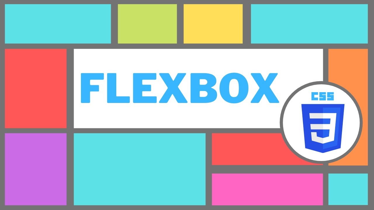
Flexbox
-
Creating a Flex container
05:08 -
Property flex-direction, flex-direction, flex-wrap, justify-content
13:52 -
Property align items, align-content, align-self, order, margin: auto
20:17 -
Property flex-basis, flex-grow, flex-shrink
17:27 -
Calculation of flex-grow and flex-shrink sizes, flexbox support
09:18 -
Layout of the layout part 1
08:45 -
Layout of the layout part 2
18:00 -
Layout of the layout part 3
19:16
Student Ratings & Reviews

No Review Yet